Paint colors for restaurants can significantly influence earnings, client conversion rates, and overall performance compared to your competition. What appears to be a simple matter of aesthetics is a well-researched topic.
The chosen paint colors for commercial building painting services and projects such as restaurants can influence the mood and how frequently customers will visit the restaurant. If you are a restaurant owner, you might wonder which color attracts more customers, and about the restaurant color palette, you need to use it.
Also, the methods that will be more efficient and quicker, like spray painting or using a roll. This is where a professional painter’s help can be beneficial. Professionals can help to choose the colors that will make your consumers feel at ease and desire to return.
How To Decide the Best Paint Colors for a Restaurant
The key to choosing the best paint colors for restaurants is looking at this topic from different perspectives; understanding each perspective has key information that can help us.
Consider your restaurant’s concept
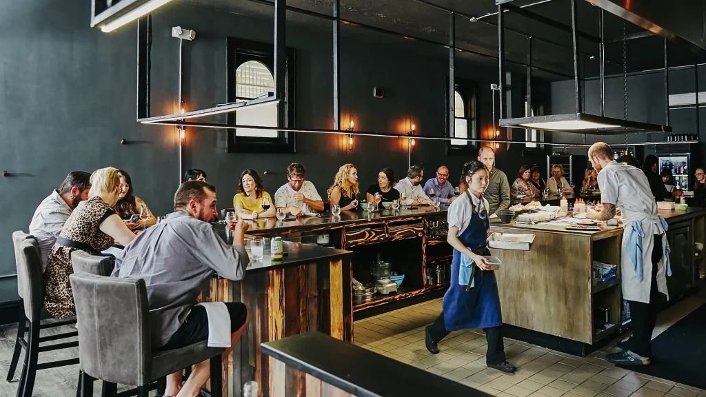
Before you start thinking about painting colors for a restaurant, you need to start with the idea. Is it a formal restaurant where you encourage guests to remain and unwind? A peaceful environment may be achieved by using neutral or earthy tones.
More dynamic paint colors may be ideal if your restaurant’s brand relies on speedy meals and servicing as many customers as possible. These laws occasionally have exceptions. Bright colors may be used in a Mexican or family-oriented restaurant to emphasize the joyful or enjoyable eating experience.

In certain circumstances, your logo and other branding aspects may assist you in determining the best paint colors. You could paint your interior to match the color palette for the restaurant website and marketing materials.
Before deciding on paint colors, consider your brand and how you want guests to feel throughout their visit. Understanding how restaurant color psychology works will allow you to choose the best color for the food business you think of repainting.
You can’t go wrong with neutrals
With neutral-colored paint, you can’t go wrong in your house or your place of business. In restaurants, warm and welcoming interiors are created using colors like white, cream, light grey, almond, and bisque. These hues are not aesthetically distracting and won’t affect someone’s appetite.
Neutral paint colors for restaurants are especially suitable for traditional, sit-down restaurants or those that provide a high-end experience. A deeper accent color, such as deep blue, brick red, or black, effectively complements a neutral hue if you’re trying for a romantic look; neutral colors help.

White may make your restaurant seem clean, but too much of it might make customers think of a hospital or other sterile atmosphere. If you want to use it for the bulk of your interior space, use an off-white or cream-colored paint.
Light paint colors for restaurants, such as neutrals, can also make your restaurant area appear larger. In contrast, darker colors would make it appear smaller.
Next best overall choice as paint colors for the restaurant: earth tones
Because they mimic nature’s palette, earthy colors like brown, dark orange, olive green, and umber are suitable for food-service businesses. These paint colors for restaurants may be a good fit if you focus on an organic, natural, or healthy menu.

Earth tones are also welcoming, calming, and pleasant. They are typically seen at health food stores, yoga studios, and massage spas. They’re also exotic, which makes them ideal for ethnic restaurants.
Most significantly, they mimic the appearance of most naturally occurring meals, such as fruits and vegetables, and can stimulate a diner’s appetite.
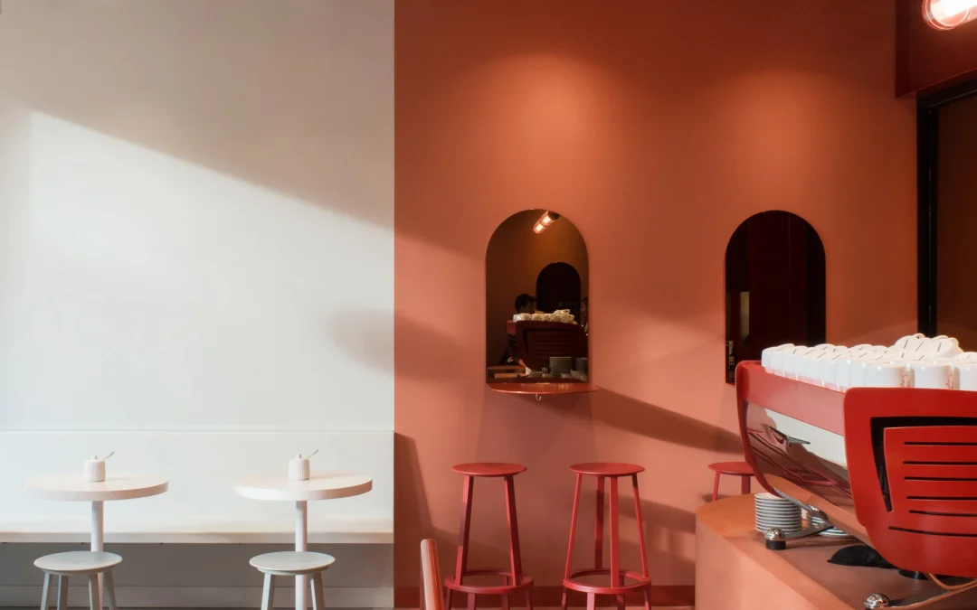
Good for cafes: pastel hues
Pastel hues are typically associated with more informal eating venues such as bistros, cafés, ice cream parlors, and diners. They radiate a lightheartedness that invokes childhood and good times.
If you lighten them up further, they become neutral tones that fit your restaurant style. They can also be paired with a darker accent color.

Use bright paint colors for restaurants that are fast serve
Warm and bright paint colors may be appropriate for fast-food restaurant color schemes and food-service organizations that aim to keep their clients moving. They elicit a sense of vigor and enthusiasm. In particular, orange, red, and yellow are upbeat hues emphasizing the need to receive food soon.

However, you don’t want to go overboard by painting your restaurant with various eye-catching colors. Instead of placing them on all the walls, stick to one or two or use them to accent portions of your business. An overpowering restaurant color combination may turn customers off.
The One Color That Restaurants Should Avoid
While peaceful and tranquil, blue colors are not a good option for the food-service business. Blue, when paired with food, tends to suppress one’s appetite.
There are a couple of exceptions. Blue makes people thirsty. Therefore it can be a nice choice if you own a bar or coffee business. Oceanfront restaurants may also choose to include blue in their color design to highlight their natural surroundings.

The Right Restaurant Colors Can Boost Your Sales
As you can see, choosing the right paint colors for a restaurant might help you attract more guests, but it is a delicate balancing act. You want to set the proper tone with your customers and business while ensuring that the paint enhances the eating experience.
It’s better to contact a professional to help you get advice on the best paint colors for a restaurant! But first, you need to know how to hire a painter or contractor in Toronto.